Free setup! Speak with us anytime: 480-624-2500
Using the Compare Stats Tool
Have you seen the Compare Stats button at the top of your Email Marketing Dashboard? What exactly can you compare with this tool? If you're trying to measure the effectiveness of different campaign types, or other differences between mailings like subject titles, compare stats gives you multiple ways to view the data. This is a great tool to use for any A/B testing that you want to do.
To Use Compare Stats:
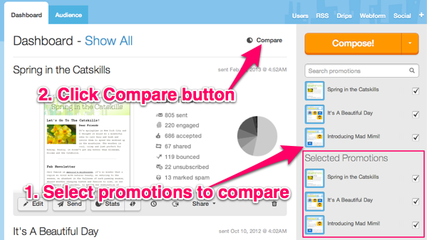
- Select the campaigns you'd like to compare, by ticking the checkboxes next tot he tiny thumbnails, on the right sidebar in your Dashboard.
- Click the Compare button.
- Email Marketing plots the stats for all of the campaigns selected, in a bar graph display, on the next page.
- You can view any of the mailing statistics metrics, and see how each campaign compares to the other. Just choose your desired metric from the tabs, along the bottom of the bar graph.

Scaled, Percent, or Number View
The default display is in Scaled View. This plots all stats scaled to 100%. So you can compare the types of stats equally between all three campaigns, regardless of whether they were sent to the same amount of people.
There are two other compare stats views available, that you can use to slice the data in different ways.
You can click on the % button at the top to view the stats displayed in Percent View. This view compares the percentages of all stats to each other. So a campaign with a 100% engagement rate would exceed other compared mailings, even if it was sent to the smallest number of contacts.
The No. button will display the Actual Number View. Here we're comparing the actual number of contacts that viewed, engaged, bounced, etc. So a campaign sent to the most people will overtake the display as the largest bar on the graph.
You can click through all of the tabs of the different metrics, to compare any stat type between the campaigns: accepted, bounced, viewed, engaged, shared, growth, forwards, and marked as spam.
Related Topics:
Can You Explain All Of The Stat Types?
Can I Create A List From Stats?
How Do I View Stats For Just One Mailing?
What Is The Suppressed List?
Domain Registration
Pay less for website domain names. Register your own .com, .net or .org for as low as $10.18 per year. We have everything you need to get online with your new domain.Website Builder
For as little as $3.89 per month you can build your Website online with Website Builder using our easy to use professional templates. Play Video - Demo
Quick Shopping Cart
Build and run your own successful online store in minutes. You're just five easy steps away! Shopping Cart works with Google® and eBay® Play Video
Website Hosting
Everything needed to give your website the high-performance home it deserves. Protect transactions and secure your customer's data with a SSL Certificate
