
GoWebsite provides Domain Registration,
Website Hosting,
On-Line Shopping Carts,
SEO, WordPress
Hosting, Email Accounts,
SSL Certificates,
Website Builder & other
Web Development Products.
Free setup! Speak with us anytime: 480-624-2500
Free setup! Speak with us anytime: 480-624-2500
Change Text Box
You can change a text box's look, such as its background color, size, and border. Text boxes are great for labeling images since you can change each independently.
- Log in to your Website Builder.
- Click Edit Website.
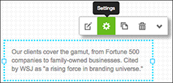
- Click the text box you want to edit and click Settings.
- Use the Text Settings box to add or edit effects for your selected text box:
- Click Publish to update your Website online.
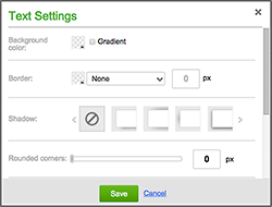
| Text Box Settings | ||
|---|---|---|
| Background Color | ||
Besides setting the color with the first box, you can select Gradient to blend that color with a transparent block or second color. Click the little switch-block arrow to toggle the blend direction between vertical and horizontal. 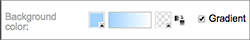 |
||
| Border | ||
| Click the box (set to transparent by default) to choose a color, click the middle arrow on to select a border style and then set the border width by entering a number in the px field. | ||
| Shadow | ||
| Apply one of four lighting effects to text box's edge. | ||
| Rounded Corners | ||
| Drag the slider to the right to increase the rounding. | ||
| Transparency | ||
| Drag the slider to the right to make the entire box — and the text within it — more transparent. | ||
| Margin | ||
| Drag the slider to the right to add more space around the text in the box. | ||
| Size | ||
| While you can resize the text box by dragging any corner, entering numbers in the Width and Height fields makes it easy to specify a particular dimension. | ||
Next Steps
Domain Registration
Pay less for website domain names. Register your own .com, .net or .org for as low as $10.18 per year. We have everything you need to get online with your new domain.Website Builder
For as little as $3.89 per month you can build your Website online with Website Builder using our easy to use professional templates. Play Video - Demo
Quick Shopping Cart
Build and run your own successful online store in minutes. You're just five easy steps away! Shopping Cart works with Google® and eBay® Play Video
Website Hosting
Everything needed to give your website the high-performance home it deserves. Protect transactions and secure your customer's data with a SSL Certificate
Copyright © 2005 - 2020. All rights reserved.
Privacy Policy